My Go-To Benjamin Moore Paints in 2022
The colors you chose to bring into your home are not only a reflection of your design and aesthetic, but they become the canvas which brings everything together. Paint changes and reacts depending on your location, time of day/year, lighting, and what it is in relation to. Below are 7 of my Benjamin Moore “Go-To” paints in 2022:

Super White OC-152
My favorite “white” paint for trim and molding. Creating a crisp delineation from the wall color that “suggests clarity and simplicity”.

Cloud Cover OC-25
A dreamy off-white subtle shade with a gray-blue tint that works well in contemporary interiors. It’s also my favorite number :)

Pale Oak OC-20
A great alternative to white on cabinetry, Pale Oak is a versatile neutral that works with every metal finish for hardware or plumbing.

Balboa Mist OC-27
My favorite “Go-To” Greige, Balboa Mist is “pale gray with a slightly warm cast” which works great in Transitional to Contemporary Interiors.

Graytint 1611
I can never go wrong with this “soft neutral featuring a whisper of gray”. Whether on cabinetry or walls this is a timeless, classic paint.

Van Deusen Blue HC-156
My favorite navy! The perfect blue for traditional to modern spaces. It works well with whites, rich woods, and nickel or brass metals.

Wrought Iron 2124-10
A soft shade of black great for painting doors or railings when simulating metal. Rich and moody when used on cabinetry or walls.
There are many more great paints and having a Designer by your side in curating the perfect palette for your home’s color story is key in a successful remodel or renovation.
“Disclaimer:
This blog is a personal blog written and edited by Cynthia herself. This blog and/or author has not accepted any forms of cash advertising, sponsorship, paid insertions or other forms of compensation. ”

Exterior House Painting Tips
Today marks the beginning of Daylight Savings Time and with longer, sunny days ahead, cue in the spring cleaning and home improvement projects ahead. Many home owners are looking for ways to spruce up their homes. One way to do so is by changing the paint on the exterior of your home.
As featured with REDFIN: Exterior House Painting tips by CPB Designs

Today marks the beginning of Daylight Savings Time and with longer, sunny days ahead, cue in the spring cleaning and home improvement projects ahead. Many home owners are looking for ways to spruce up their homes. One way to do so is by changing the paint on the exterior of your home.
As interior design and architecture tend to go hand in hand, interior designers are often asked to assist in the selection of paint for home exteriors due to their color consulting skills and tips.
“With so many paint colors, finishes, and factors to consider when undertaking an exterior paint update, choosing a paint color can seem like an intimidating decision to make.”

While this can tend to be a big job, here are 3 easy tips:
Select colors that complement the period of your home.
Divide your home into 3 sections when selecting paint colors:
Siding color
Trim color
Door and/or Shutter color
Lastly, place the samples at the front of your home, or an area where you can see all 3 paint selections working together, and observe them during different times of the day.

For more tips, musings, project updates and features, subscribe to the blog and follow me at Instagram and Facebook.
Cynthia

COLOUR
Color Theory and Interiors
Col•or
/kələr/

Color encompasses every aspect of our lives. It can affect our emotions and senses, holds cultural symbols and meanings, and can be a powerful communication tool.
Color is on every thing!
From the clothes we wear to the food we eat to the spaces we inhabit. It is already known that the easiest way to give any space or item a face-lift is with paint (ie: color) no matter the hue. The color choices we make “reflect a deeper meaning about our personality traits” and “every color carries a vibration”.
The way we use it can affect our lives.
WARM COLORS
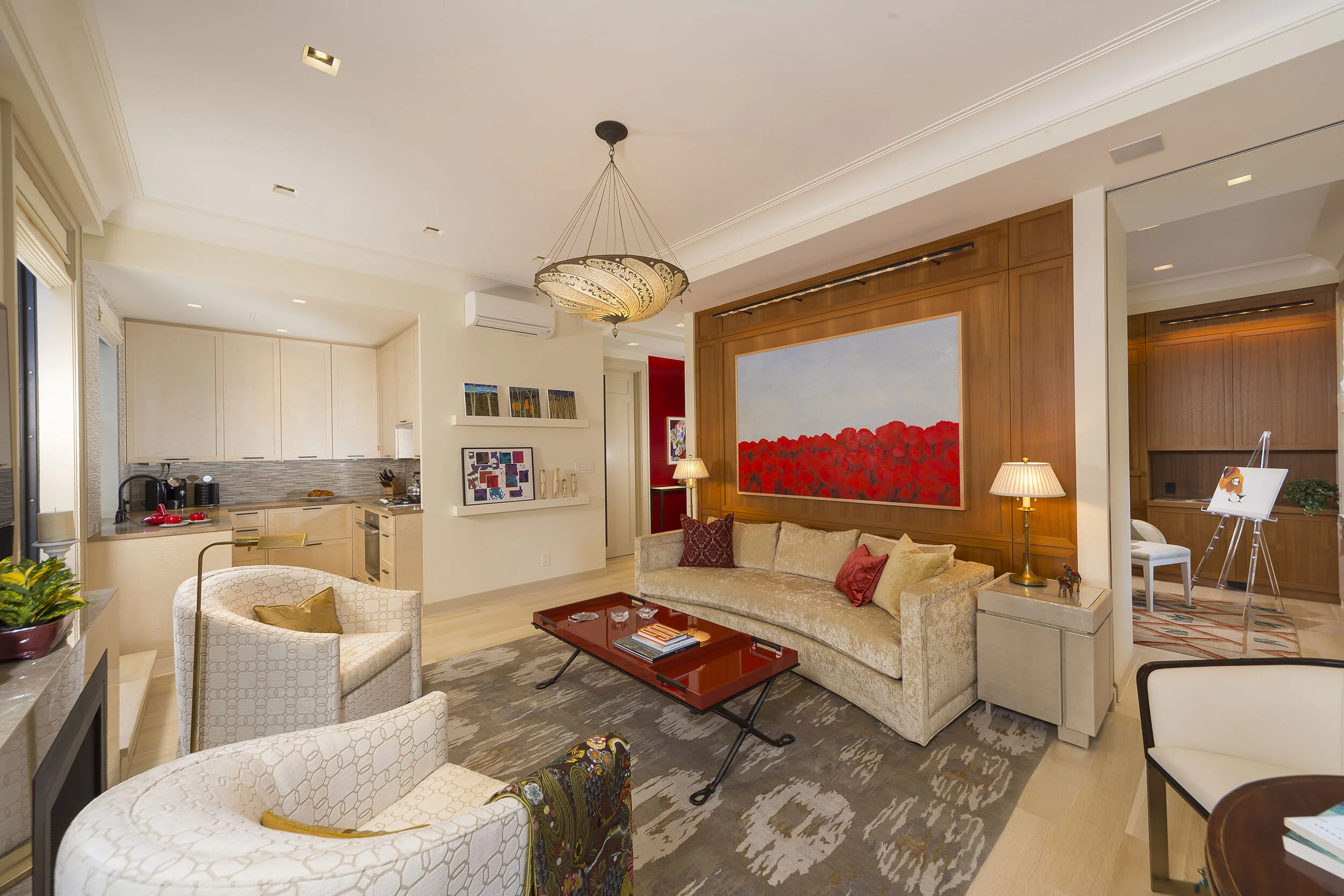
Yellow, Orange, and Red are seen as energizing, passionate, and positive hues. They make people happy and enthusiastic.
Yellow fosters optimism thanks to sunshine and sunflowers. Used in entryways for a nice surprise upon entering or as accents throughout a space for an eye-catching pop of color.
Orange is a color that helps with creativity and energy; great for office spaces and kid playrooms.
In some cultures, red is the color for success and good fortune. Caliente, a fiery red, was Benjamin Moore’s 2018 Color of the Year.


COOL COLORS
Green, Blue, and Purple are seen as calming, relaxing, and reserved colors.
Green symbolizes wealth, growth, and nature. Farrow and Ball’s resident color creator is showcasing green hues in 2020 to help create spaces that are warm, comforting, and grounding with their Duck Green and Sap Green paint colors.
Blue has been culturally used to represent peace, holiness, and royalty. Both Pantone and Sherwin Williams have chosen a blue for their 2020 Color of the Year. Pantone’s Classic Blue, “a familiar, calming shade of azure” and Sherwin Williams’ Naval being a deep, classic navy. I’d say both seemingly appropriate colors for our current times.
Purple inspires spiritualism, is magical, and gives a sense of luxury.


NEUTRALS
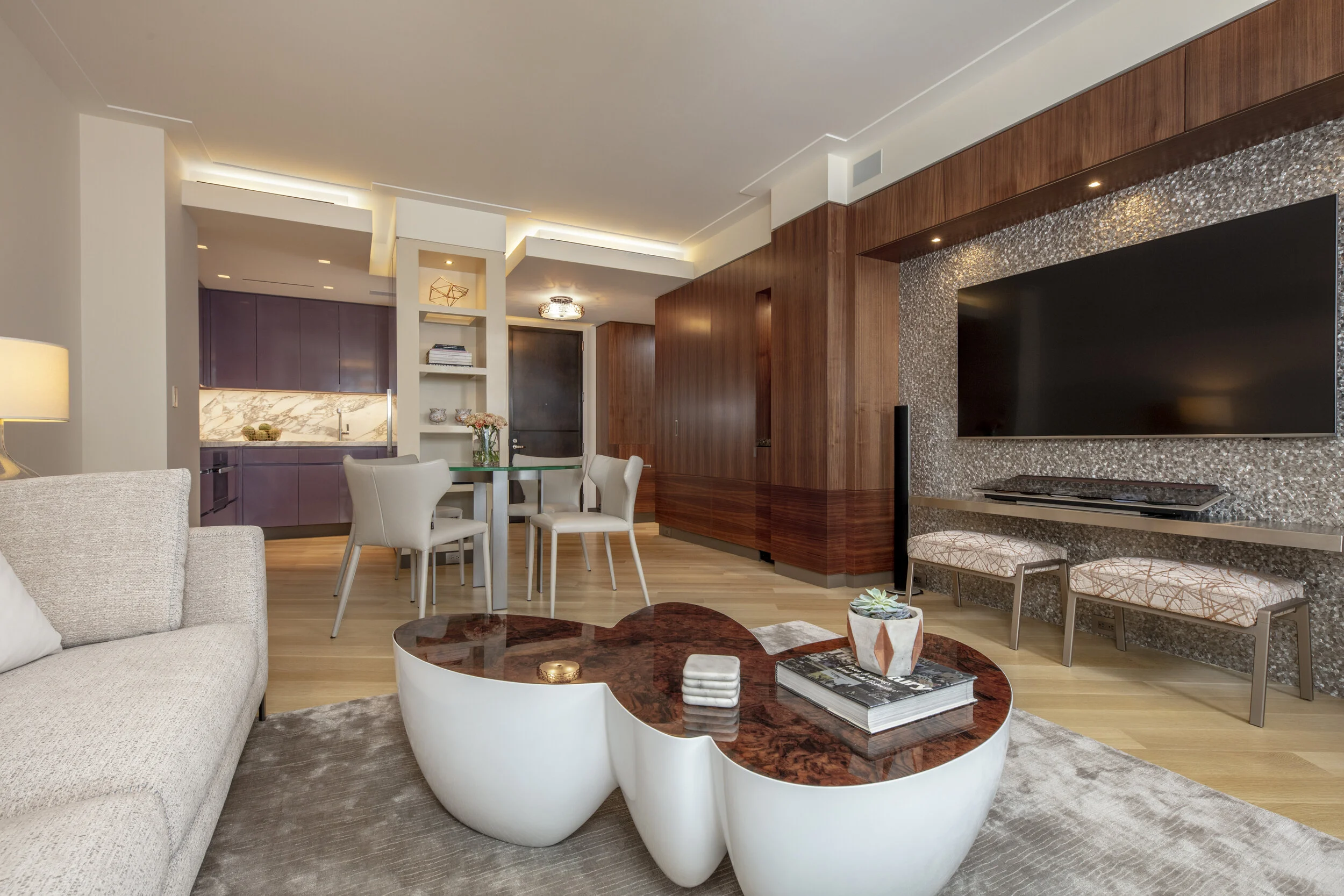
We cannot forget about our neutral hues ranging from White to Black.
White and Cream give a sense of purity and cleanliness. Its versatility in sleek and modern design to cozy Danish and Scandinavian interiors make it a goes to color for creating a sense of calm and order.
Beige and Brown are conservative and wholesome. Beige was the go-to color for interiors in the ’90s to early 2000s. Providing a great backdrop for every design aesthetic.
Black and Grey are considered moody, mysterious, and/or elegant. These hues have really made a statement for the past 10 years. Grey especially has made a splash onto every surface of our homes ranging from walls to cabinetry, furniture, stone, and tile, fabrics, etc. Last year’s Benjamin Moore Color of the Year, Metropolitan AF-690, is a soft grey said to provide effortless beauty and sophistication.


Color is an integral part of our environment and color consultations are a great way to identify potential hues to try out in your home. Choosing the color that matches your personality and style will not only enhance your interiors but your life as well.
Let me help you select new colors for your space with a one-on-one Color Consultation!
- Cynthia
“The best rooms have something to say about the people who live in them”